Thanks for volunteering!  Before getting started, I'd like to obtain
the answers to a few questions.  Many of these will be revisited in
the post-study interview, so think about them as you use the interface.


I. Computer usage (use recent and expected usage)

How many hours per day do you spend in front of a computer?


Estimate the percentage of time you spend doing various activities:
__% coding/debugging
__% writing (not code)
__% email
__% research on the Web
__% Web browsing (entertainment)
__% other (list major components)


What desktop information monitoring tools do you currently run?

[] email biff
[] clock
[] load monitor
[] ICQ/buddy tool
[] plan/scheduling tool
[] other (please list)


How frequently do you "act" on the information?  That is, how often
  does the information you see result in you doing some other activity
  like checking your mail, killing a process, starting/contributing to
  a chat session, or going to a meeting?
[] once a day or less
[] 2-4 times a day
[] 1-2 times an hour
[] every few minutes


Do these type of tools ever distract you to the point that you turn
  them off?  What aspects (sound, motion, etc) are distracting?


II. Information consumption

How often do you browse the Web?
[] less than once a day
[] daily
[] 2-3 times a day
[] 4+ times a day


What Web pages do you visit regularly (at least once a day)?


At what times do you browse the Web (select all that apply)?

[] when I first log in
[] at/around lunch
[] before I log out for the day
[] other set times (list examples)
[] whenever I have a free moment


What other Internet activities do you participate in regularly (daily)?

[] MUDs/MOOs
[] Usenet news
[] online games
[] chat rooms/groups
[] other (please list)
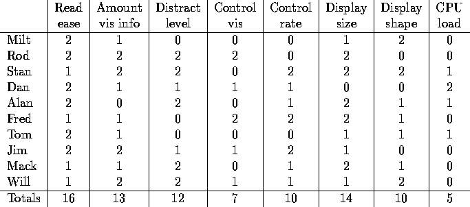
Table 10:
Factors that users said contributed to their choice of display.
A 2 indicates that the factor contributed greatly, a 1 indicates
some contribution, and a 0 indicates little or no contribution.
The first column reflects the impact of ease of readability on the choice of a display. Almost everyone rated this highly regardless of the type of animated display that they prefer. This suggests that each individual has a different opinion of the readability of displays.
The second column reflects whether the amount of visible information on the screen at any given time was a factor in choosing a display. As one might expect, the participants who value this tend to prefer the list or ticker displays, in which multiple items can be displayed.
The third column indicates whether the distraction caused by the animation was a factor in choosing a display. It was expected that the constant motion of the ticker would be distracting, and only participants who were less sensitive to the potential distraction of an animation would prefer ticker. However, this was not the case: participants who gave this factor a high rating included participants who favored ticker, fade, and list.
The fourth column indicates whether control over the amount of visible information was a factor in choosing a display. This was rated the least important factor, perhaps because participants did not want to expand the size of the display.
The fifth column indicates whether control over the rate of change of the animation was a factor in choosing a display. Note that this is different from the desire to interact with the display as it is running. Control over the rate of change refers to the speed at which the animation moves, while the desire to interact with the display refers to the ability to click and grab the display to change it. Results from two factors are not correlated.
The sixth and seventh columns indicate the participant rating of display size and shape on display choice. Most participants indicated that they cared about this primarily with regard to the size and shape of the list, which dominated the display if more than a few items were being monitored. However, occasionally participants who did not have a strong preference to ticker of fade indicated that they simply chose the one that best fit onto their screen.
The eighth column indicates the importance rating for CPU load. The ticker can require a significant amount of computational power in updating the display, and participants in the pilot study had mentioned it as a factor for not choosing the ticker. However, in this study only one participant indicated that it was a highly important factor, and he stated in his interview session that this was because he wanted the ticker to run more quickly than it could.
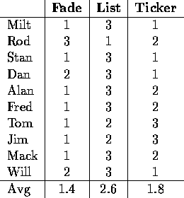
Table 11:
User favorites for each of the display types.
Occasionally users listed more than one favorite,
in which case both have the same value.
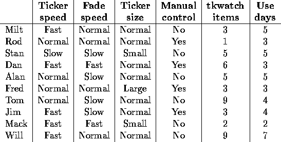
Table 12:
System usage characteristics recorded
from the participants' recorded usage sessions.
Note that they may occasionally differ from the reported favorites.
In this table ``normal'' speeds and sizes refer to the default values,
with all other measures relative to the default.
As one user (Matt) did not use tkwatch for more than a few minutes,
insufficient data were available to include him in the table.
The first two columns show the animation speed selected by the participant late in the study. The expectation was that participants would experiment with various speeds before settling on a single desired speed. (The data and interviews seem to reflect this.) The normal speed for fade and ticker is the default speed as identified by participants in the pilot study. Note that participants seem to prefer faster speeds, particularly for the ticker. Perhaps this is because there is much more information that is to be displayed, and participants are more anxious to see it all.
The third column shows the typical size for the ticker animation. The normal size 80 characters, and participants only seemed to resize it to fit in in available spaces, not for readability or distraction reasons. (Since the fade display always shows a single block of information regardless of its size, it did not make sense to resize it and thus fade size is not in the table.) In general, participants seemed content with the size of the ticker. In the cases when they were not, they indicated a desire to fit the display to a particular area of the screen, not a desire to make it more comprehensible or less distracting as one might expect.
The fourth column indicates whether participants manually controlled the flow of information by clicking, grabbing, and dragging. A ``yes'' response indicates that participants controlled the flow more than five times, while a ``no'' response was less than or equal to five. The expectation was that participants may experiment with the manipulations on a few occasions, but would only do so repeatedly if they found it useful.
The fifth column reflects the median number of informational items monitored by a participant. An informational item is weather data, stock quotes, sports scores, or a news topic. As one might expect, participants who monitor a large number of items tend to dislike the list display, which requires screen space proportional to the number of items being monitored.
The sixth column indicates the number of days that the participant used tkwatch. This value was reported by the participants and confirmed by the collected data. I wanted to be sure that each participant had used tkwatch on multiple occasions over an extended period of time.