

Next: Supporting Awareness with Animated
Up: Maintaining Information Awareness in
Previous: Evaluating Animation as an
While one might suspect that one display type, size, and speed
would be intrinsically better and a clear favorite for a given task
like basketball score monitoring,
the pilot study revealed that users of peripheral animated displays
have relatively equally distributed preferences for animation type,
the size of the display, and the speed of the animation.
This suggests that the preferences are perhaps related to
the way in which people want to acquire information
rather than simply to the nature of the information itself.
This chapter examines whether characteristics of an animated display
impact information acquisition during the awareness process.
For instance, one might hypothesize that
a fading animation might be better suited
for watching for a specific change,
a slow display might be less distracting to a user
who is more interested in other non-peripheral tasks,
and a large display might aid the user in processing
and remembering displayed information over time.
If results such as these are shown to hold,
there would be a better mapping between the goals of a user
and the characteristics that should be incorporated
into a peripheral display.
To examine whether animated displays
impact information acquisition during the awareness process,
two empirical evaluations were conducted.
Participants were asked to complete a central activity
while simultaneously watching a peripheral display
showing constantly changing news, weather,
stock, and sports information.
As the central activity,
participants performed a series of browsing tasks
where they searched a hypertext environment
for the answers to questions.
To motivate participants to watch the peripheral displays,
participants were asked simultaneously to perform monitoring activities
that asked them to press a button when they noticed
specified information in an animated display at the top of the screen.
At the end of each round
of monitoring activities and browsing tasks,
participants would answer a series of awareness questions
to test the memorability of the information that was displayed.
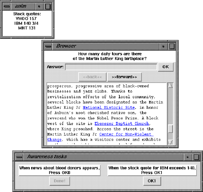
The layout for the experiments can be seen in Figure 8.
The motivations for these experimental choices follow.

Figure 8:
Layout of the experimental environment experienced by participants.
At the center is the browser used by the participants in the experiment.
At the top of the screen is a peripheral display
that cyclically showed the state of several types of information.
At the bottom is the area used for monitoring activities.
After each round, the screen cleared except for a question area
where the awareness questions are presented.
A central activity is necessary because in realistic settings,
individuals would not spend their time staring at an animated display
but would focus their attention elsewhere.
Most prior studies examined reactions
to standalone displays [19, 28, 37].
For the one that did not, the primary task
was an editing task [45].
From the pilot study and the observational study,
it was noted that many users do not prefer to use animated displays
at all times, but rather they only use them during certain
low-cognition tasks like browsing the Web or looking at email.
As such, it seems appropriate to choose a similar task
as the primary task for this experiment.
As a central task in both of the experiments described here,
the participants performed browsing tasks that required them
to search in a hypertext environment for specific information.
In performing the browsing tasks, participants used
a simple browser and hypertext pages.
The browser consisted of an information area
containing shortened versions of pages taken from World Wide Web sites.
The text-only information area contained highlighted, underlined links
that pull up other pages when clicked with the mouse.
The participants navigated the information space
by clicking on highlighted underlined links
and with forward and back buttons.
These buttons work just like corresponding buttons
on browsers like Netscape Navigator and Microsoft Internet Explorer.
The browsing tasks were non-trivial:
the participants had to read and navigate through a hypertext space
to find certain information in the pages, enter it into a box
connected with the browser, and press a button to continue.
To minimize the typing required, all solutions were numerical
(for example, ``In what year was Mount Rushmore carved?'')
If an incorrect answer was entered, the interface beeped
and the participant had to continue searching
until the correct answer was entered.
When the correct answer was entered,
the participant could proceed to the next browsing task.
While performing the browsing tasks,
the participants were asked to monitor
the contents of a peripheral display.
The displays included an in-place sudden
rapid serial visual presentation (RSVP) display
referred to here as a blast display,
an in-place gradual fade display,
and a gradual motion-based ticker display.
The participants used information in the peripheral display
to complete a set of monitoring activities
and to answer a series of awareness questions.
By including both short-term monitoring-style awareness activities
(called monitoring activities)
and longer-term knowledge-gain questions (awareness questions),
these experiments simulated a wide range of informational situations
that could occur on a daily basis.
For example, people need to monitor
traffic incidents, weather disturbances, and important email
that may affect their current behavior at least in the short term,
yet they also may want to keep track of
temperature patterns, sports scores, and news headlines
that may be of general interest but not to the point
that it would change their current behavior.
The peripheral display cyclically showed instances
of different types of information, such as a ball score,
a stock quote, and a weather report. Each instance was updated
frequently as it would be in real life.
In the monitoring activities,
participants were asked to press a button
when the information in the peripheral display matches some criteria
(for example, ``When the temperature drops below 35, press OK1.'')
The information that was selected for display was interesting
but rarely vital, and the informational occurrences that were
selected were selected because they might
spur a user to perform some activity,
such as bringing in a plant that is outdoors
or selling a stock that is performing poorly.
Each round included two such accompanying monitoring activities.
If the button was pressed at the correct time,
it was greyed out to alert the participant
that the task had been completed successfully.
If the button was pressed too soon,
the interface beeped and the button remained active.
At the end of each round of monitoring activities,
the participants were given awareness questions
that asked them to recall information
that was shown in the peripheral display.
The questions were multiple-answer multiple-choice questions
that addressed both content and temporal issues.
Each question had four possible answers,
and there was always at least one correct answer.
Generally there were either one or two correct answers,
but sometimes there were as many as three.
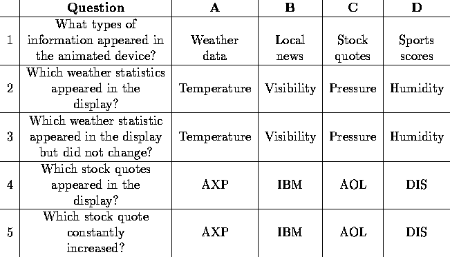
The first question always presented four types of information
and asked the participant to choose the ones that had been displayed.
Later questions asked about details of the information,
such as which news stories appeared, which stock quotes
constantly increased, or which sports team scored the most points.
Initially all of the answers were unselected.
The participants clicked on the answers to select them,
then clicked an OK button to move on to the next question
or complete the question session.
To compare performance among groups,
the times for all browsing tasks and monitoring activities
and the answers to the post-round awareness questions were recorded.
The results were analyzed to determine
whether differences in certain measures occurred
for different groups of participants
(participants using different peripheral displays in the first experiment,
and participants using different sizes and speeds in the second).
In instructing the participants, it was emphasized that fast performance
on both browsing tasks and monitoring activities was important.
The participants were informed that questions about the information
in the peripheral display would be asked,
and they were given sample questions to prepare.
The browsing time is the time from which the browsing task
and browser information appeared on the screen
to the time when the participant typed in the correct answer
and pressed the OK button.
Since the order in which browsing tasks were presented
was held constant for all participants in each experiment,
the average browsing times for a participant in a group
could be compared.
For the monitoring activities, the monitoring time
is the time from when the information
was first entered into the cyclic display
until the information was acknowledged as seen by pressing a button.
Again, the order in which monitoring activities were presented
was held constant for all participants for each experiment.
Since participants did not have to complete all activities,
the number of activities that were completed in each round
were compared between groups.
For the awareness questions, the participants' responses
to each of the four answers were collected.
I considered each question as being worth four points:
correctly or incorrectly assessing each possible response
to a question.
A number of different methods can
be used to determine a participant's ability to recall information.
The most obvious measure for determining responsiveness
is to compare the percent of correct responses
for the awareness questions in different situations.
The percent of correct responses
is referred to as the correctness rate.
The correctness rate measure potentially can misrepresent
a participant's awareness of information.
Note that a participant who did not remember seeing anything
in the peripheral display and left all responses unchecked
would have a correctness rate as high or higher
than a participant who remembered seeing several items
but was mistaken about what was seen and checked the wrong box.
Consider as an example the situation
where a question asks a participant to select items
that appeared in the peripheral display,
where three of the selections were present and one was not.
A participant who recalled seeing three items in the display
but only was correct about two of them
would have a correctness rate of 50 percent,
identical to the correctness rate for a participant
who only recalled seeing one of the items that was present.
An alternate measure for determining responsiveness is the
hit rate, a term from signal detection theory defined as
the ratio of correct stimuli responses to the total number of stimuli.
In the situation described above, the hit rate for the participant
who recalled seeing three items but was only correct about two of them
would be 67 percent (two of three stimuli were correctly identified)
while the participant who correctly recalled seeing only one item
would be 33 percent (one of three stimuli were correctly identified).
Since a typical goal of using a peripheral display
is to proactively recall seeing information,
it may be better for a participant
to be mistaken about seeing information that was not displayed
than to be mistaken about not seeing information that in fact
was displayed.
The hit rate is hard to interpret unless accompanied
by the false alarm rate, the ratio of incorrect stimuli responses
to the total number of times when the stimuli was not present.
In the situation described above, the false alarm rate for the
participant who recalled seeing three items when only two were present
would be 100 percent (the one item that was not present
was incorrectly identified as being present).
As one might expect, a higher hit rate is often accompanied
by a higher false alarm rate as well.
This work will consider whether this is the case
for awareness situations.
The hit rate and false alarm rate are important
in situations such as airport security detectors,
where more hits means that a bomb or other illegal device
is less likely to pass through undetected.
One can certainly see parallels in information awareness. Perhaps
a person wants to remember that a story occurred, or that a
tornado watch is under way, or that a traffic bulletin appeared.
The hit rate would reflect the awareness potential
of an animated display.
In analyzing the results,
analyses of variance (ANOVAs)
were performed to check for statistical significance
among different conditions of the experiments.
ANOVA is a test performed
when there are more than two conditions in the experiment.
A description of ANOVA and its advantages
can be found in most statistics textbooks,
see for example [29].
When reporting ANOVA statistics, three values traditionally
are provided:
- F(x,y) represents the ratio of variance among groups
to variance within groups (that is, individual subject differences).
The x and y values reflect the number of cases
and the number of participants, respectively.
- MSE is the mean squared error.
- p is the probability that the difference occurred by chance.
Traditionally if this is less than 0.05, the results are said
to be statistically significant.
If the ANOVA revealed a significant difference,
pairwise t-tests were performed
to determine which conditions differed.
For t-tests, the p value is given.
Again, a more detailed discussion of t-tests can be found
in most statistics textbooks (see [29] for example).
The remainder of this chapter describes
the two empirical evaluations
that were performed to explore the relative advantages
of different animation characteristics.
The first experiment, described in Section 5.2,
compares relative performance
when using fading, tickering, and blasting displays
as well as when no animation at all was present.
The second experiment (Section 5.3) explores the impact
of changes in the size and speed of the animated display.
Section 5.4 examines participant reactions
to animated displays collected after completing the experiment,
and Section 5.5 provides a general discussion
and some recommendations gleaned from the two experiments.
Will peripheral animation indeed distract a user from other tasks?
Or can it help with this emerging awareness task?
Are different animations better suited
for different information types?
To address these questions, an experiment was conducted
to examine the awareness capabilities
of three types of peripheral displays:
a motion-based effect that moves or tickers
information across the display area,
an in-place fade effect that gradually
changes information at a fixed location,
and an in-place sudden RSVP or blast effect
that rapidly changes the visible information
without the benefit of smooth animation.
This experiment focused on three factors:
the possibility for degradation in performance
on a browsing task when an animated display was present,
the speed in identifying and reacting to changes in peripheral displays,
and the ability to remember information
that appeared in a peripheral display.
Seventy undergraduate students participated
in this experiment for class credit.
The experiment was conducted on Sun Sparcstation 2 workstations,
each connected to a 15-inch monitor with an optical mouse.
Participants were run in small groups, one participant per computer.
The experiment was explained to each group verbally
and again on the computer with examples.
The participants performed six rounds of browsing tasks,
monitoring activities, and awareness questions.
In each round, participants completed four
browsing tasks using a simplified browsing environment.
During each round, participants performed two monitoring activities
using either a fade, ticker, or a blast animation.
The speed with which the information was displayed
corresponded to the mean speeds selected by the participants
in the pilot study described previously.
While this resulted in different rates
of information display for the animations, I felt it was a more
realistic and ecologically valid measure of how people would use them.
The ticker continually shifted one pixel every 50 milliseconds,
while the fade and blast updated their entire contents
every 2000 milliseconds.
The fade required 500 milliseconds to fade between items,
while the blast updated instantaneously.
For the first three rounds, the peripherally displayed information
was a mixture of sports scores, stock quotes, weather information,
news headlines, and email sender names. The latter three rounds
each focused on a single type of information: stock quotes,
news headlines, and sports scores, respectively.
At the end of each round, the participants were asked awareness questions
about the information that appeared in the animated display.
The first question asked which types of information appeared in the display.
For each correctly-identified instance of information appearing,
two questions about the information were asked
up to a total of five questions.
See Table 6 for sample questions and responses.

Table 6:
An example of the awareness questions and responses
The independent variable was the type of animation used.
This was a within-subjects experiment: all participants experienced
all animations, with orders based on
a latin square design (browse - fade - ticker (n=17),
fade - ticker - browse (n=17),
or ticker - browse - fade (n=21)).
A different animation was used for each of the first three rounds
with the order repeated on the last three.
In addition, one group (n=15)
did not have any animations present at any time
and as such performed only the browsing tasks.
The dependent variables were the completion times
for the browsing tasks and monitoring activities.
The completion times for the browsing tasks
were measured from the start of each round (for the first task)
or from the completion of the previous task.

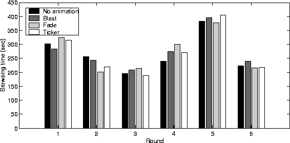
Figure 9:
Average completion times for browsing tasks for each round
based on the type of animation that was present.
Participants performed about the same on the browsing tasks
regardless of the type or even the presence of animation.
By showing the rounds individually, one can see that there is
not even a trend to suggest that participants performed
better in certain cases.
This section examines the participants' performance on the
browsing tasks, monitoring activities, and awareness questions.
For the performance times on browsing tasks,
there was not a significant impact due to the presence
of a peripheral animated display
(F(3,58)=0.60, MSE=46277.71, p=.62).
Furthermore, the type of animation
did not affect the browsing times
(F(2,46)=0.62, MSE=25411.63, p=.54),
(see Figure 9).
For the monitoring activities, the number of tasks completed
does not depend on the type of animation.
On average, participants completed 11.3 of the 12 monitoring activities,
including 3.83 of 4 for blast, 3.79 of 4 for fade, and 3.71 of 4
for ticker, not a significant difference
(F(2,96)=0.77, MSE=0.25, p=.46).
That is, it does not appear that a participant is more likely
to identify (or miss) a piece of information
when using one type of animated display than another.

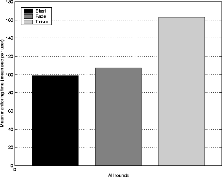
Figure 10:
Average completion times for each monitoring activity in each round.
The participants performed significantly better
with the blast and fade animations.
While the identification rate when monitoring information
was not affected by device type, the time to react to it was.
An examination of the monitoring times
for the activities that were completed
appears in Figure 10.
The times to complete the awareness activities
differed significantly depending on
the type of animations used
(F(2,52)=17.24, MSE=4528.75, p<.001).
Pairwise comparisons revealed the blast and fade animations
resulted in significantly faster awareness times than the ticker
(p<.001 and p=.01, respectively)
and there was a trend toward faster blast times than fade (p<.09).
In examining the awareness responses,
recall that each question had four possible answers,
one or more of which were correct.
Section 5.1 described three metrics
for measuring performance on the awareness questions:
the correctness rate, the hit rate,
and the false alarm rate.
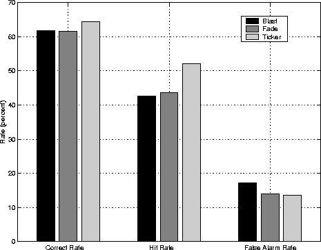
Figure 11 summarizes the results.
While the correctness rate for ticker (64.0%) was
slightly higher than that for fade (58.3%) or blast (58.2%),
suggesting that the ticker may be better,
the difference was only marginally significant,
F(2,96)=2.62, MSE=0.02, p=.08.
In turning to the hit rate,
there was a significant difference among hit rates,
F(2,96)=3.87, MSE=0.03, p<.03.
The hit rate for ticker (52.11%) was higher
than that for fade (43.66%) and blast (42.72%).

Figure 11:
Cumulative correctness rate, hit rate, and false alarm rate
for the awareness questions.
The participants had a significantly higher hit rate
when using the ticker.
Recall that one drawback of using techniques
to achieve higher hit rates is that they often result in
higher false alarm rates as well.
However, this does not seem to be the case in this situation
as there was not a significant difference between false alarm rates,
F(2,96)=0.55, MSE = 0.03, p=.58.
The false alarm rate for blast (17.18%), fade (13.97%),
and ticker (13.48%) are about the same.
The next section discusses the results.
The result indicating that browsing times are not affected
by the presence of animation may seem surprising,
but a closer examination shows that it is not unreasonable.
One might suspect that participants who are
not faced with an animation
and not burdened with the additional monitoring activities
and awareness questions would perform significantly faster
on the browsing tasks,
but the results suggest that this is not the case.
In fact, the results do not even indicate a trend toward lower times
in the cases when an animated display is present.
While this seems to contradict the results found in prior studies [45],
recall that the primary task in those studies were editing tasks
that required participants to perform in-depth readings and make corrections.
The browsing tasks were less cognitively demanding, but
based on the results of the pilot study in Section 4.1,
they also seem to better match the type of primary tasks
that a user would be doing while using a peripheral animated display.
The times to complete the monitoring activities
differed significantly depending on the type of animations used.
The blast and fade animations resulted in significantly
faster monitoring times than the ticker.
This result seems to follow from previous results
that indicate that moving text is more difficult to read
than non-moving text [67, 28].
As the tickering display relies on motion to cycle between items
while the fade and blast do not, it seems reasonable that the
ticker would result in slower performance,
particularly if the participants were reading the displays
to identify information that they were monitoring.
In analyzing the responses to the awareness questions,
the correctness rates for the three animation types
suggested that the ticker may be better,
while the hit rates verified that the ticker
resulted in significantly better performance.
This does not contradict the results noted previously
indicating that moving text was more difficult to read
than non-moving text. The nature of the monitoring activities
and the awareness questions are quite different.
In fact, other studies have shown that comprehensibility,
unlike reading speed, is not affected by motion [37],
so it is reasonable to expect that the results would differ.
The impact of these two results on the development and use
of animated displays is clear: if the goal is to identify items
quickly, an in-place display like a fade or blast should be used,
while if the goal is to increase comprehension and memorability,
a motion-based display like a ticker should be used.
The previous experiment suggested that there are differences
in performance when using the fade and ticker displays.
In a followup experiment,
I wanted to explore whether certain factors,
namely display size and animation speed,
impacted performance in any way.
Perhaps making the display area larger
would result in faster recognition times
and allow the awareness questions
to be answered with greater accuracy,
or perhaps a slower speed would be less distracting,
resulting in lower times on the browsing tasks.
Ninety-one Georgia Tech undergraduate students participated
in this experiment for class credit. The materials and procedure
were similar to the ones used in the previous experiment
with the differences described here.
A between-subjects size and speed condition was added.
The participants were presented with a display having one of three
characteristics: normal size and speed, normal size but slow speed,
or small size but normal speed.
The normal displays were used as the comparison point
for the small and slow displays.
Normal displays used large display areas and fast speeds,
though both well within the ranges of sizes and speeds selected
by participants in the pilot study.
Both the fade and ticker had a
width of 1180 pixels (about 160 characters)
with a height of one line.
This size was chosen because
it fits nicely along the top or bottom of the screen
and because it is large enough to hold long streams of information
(like news headlines and weather bulletins) in their entirety.
The ticker speed was at the upper range
of the possible speeds for the platform,
with one-pixel updates every 20 milliseconds.
Thus, for the 12-point font used in the experiment
this translates to about 6.67 characters per second,
meaning that a 20-character ball score or stock quote
would require a little over three seconds to ticker on to the display,
about 24 seconds to ticker across the 160-character display,
and another three seconds to ticker off the display.
During the experiment, the ticker experienced a slight slowdown
that makes it difficult to compare the speeds of the ticker and fade.
The fade cycle step had a 100 millisecond delay
between each of five steps
with a three-second delay before the next fade,
resulting in 3.5 seconds elapsing in a fade cycle.
The small display used a smaller area
but the same speed as the normal display.
The fade and ticker width was more than halved to 840 pixels
(about 70 characters), small enough to fit above a single window.
This reduction in size meant that most streams of information
could not be shown in their entirety using the fade widget.
Unlike in the previous experiment where long streams were truncated,
in this experiment they were split over multiple screens.
As such, it seemed that performance when using the fade widget
would suffer dramatically.
The slow display was the same size
as the normal display, but slower.
The speed was chosen to be at the slow end of the range
selected by participants in the pilot study.
The ticker updated at a rate of one pixel every 140 milliseconds,
seven times slower than for the normal display.
The fade updated one shade every 150 milliseconds
with a delay of 9 seconds before the next fade,
resulting in 9.75 seconds between each cycle.
The size for the widgets was the same as in the normal display.
The awareness questions also differed in style and number
from the first experiment. Recall that in the first experiment,
the first question asked participants to select
the types of information that were displayed,
then for each case where the participant stated correctly
that a type of information was displayed,
two additional questions were asked about that information,
the first relating to content and the second relating to order.
In this experiment, each participant answered all of the questions.
This change seemed reasonable as a person's memory
often can be sparked by seeing a word or phrase in a question.
This also generated more data and made comparisons between
participants more reliable.
The number of rounds was increased from six to eight.
It was determined that participants would still be able
to complete the experiment within the requested hour
even with the additional rounds.
Also, the type and order of the animations was changed.
Since the blast display resulted in performance similar
to the fade display and was consistently rated
as the least favorite display by participants in the first experiment,
it was not used in the second experiment.
Participants alternated between using fade and ticker in each round,
with one group starting with fade, then twice using ticker
then fade again and repeating (fade, ticker, ticker, fade),
and the other group reversing the order by starting with ticker
(ticker, fade, fade, ticker).
In summary, there were six groups of participants
differentiated by animation classification (normal, slow, or small)
and starting animation (fade or ticker).
Each group had 15 participants except
the slow fade-first group with 16 participants.
This section presents the performance results
for the browsing tasks, monitoring tasks, and awareness questions.
For both the fade and the ticker,
changes to the size and speed of the animated display did not lead to
differences in the the cumulative time required
to complete the browsing tasks,
with F(2,88) = 0.58, MSE = 765992.08, p=.56 for fade,
and F(2,88) = 0.01, MSE = 997900.50, p=.98 for ticker.

Figure 12:
Mean completion times for each monitoring activity
when using large and small displays.
Smaller displays resulted in lower times
than the larger ``normal'' displays
for the monitoring activities.
Does the size of the display affect performance on monitoring tasks?
Figure 12 suggests that it does.
When using the ticker, the time to complete the monitoring activities
was significantly different based on the size of the animated display,
F(2,29) = 5.23, MSE = 40792.90, p=.01
with p=.02 for the pairwise t-test.
When using the fade, despite the large difference in the means,
the monitoring time did not differ based on
the size and speed of the animated display,
F(2,66) = 1.62, MSE = 12712.58, p=.21.

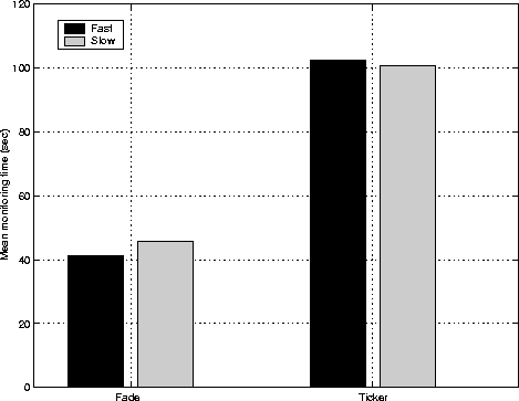
Figure 13:
Mean completion times for each monitoring activity
when using fast (normal) and slow displays.
For each animation type,
there was no significant difference in monitoring times
based on the speed of the animation being used.
Does the speed of the display affect performance on monitoring tasks?
As seen in Figure 13, for each display type
the monitoring times appear to have been similar
regardless of speed. The analysis verifies that
there was no significant difference:
for the ticker, the t-test resulted in p=.79,
for the fade, p=.87.
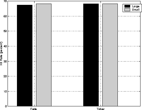
The cumulative hit rate when using the fade
was virtually identical regardless of display size or speed,
F(2,88) = 0.09, MSE = 0.02, p=.92.
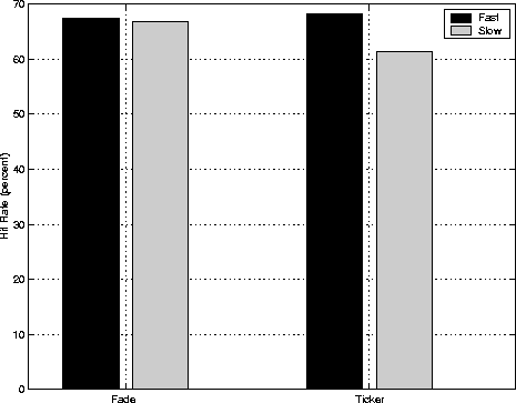
However, when using the ticker, the hit rates did differ
significantly, F(2,88) = 3.26, MSE = 0.02, p=.04.
As one might suspect from Figure 15,
a t-test revealed that the difference between
the normal and slow displays was significant (p=.03),
while the difference between
the normal and small displays was not (p=.98).
The false alarm rate did not differ regardless of display size or speed
for either the fade (F(2,88)=2.24, MSE=0.01, p=.17)
or the ticker (F(2,88)=0.10, MSE=0.01, p=.91).

Figure 14:
Cumulative hit rate for the awareness questions
when using large and small displays.
There is not a significant difference between the hit rates.

Figure 15:
Cumulative hit rate for the awareness questions
when using fast and slow displays.
The slow ticker resulted in a significantly lower hit rate.
While one might suspect that changes in the nature of the display
might result in differences in browsing task times, this was not the case.
This result extends the corresponding one from the previous experiment:
as was noted previously for the type or presence of an animated display,
neither the size of the display nor the speed of the animation
seems to negatively impact the time required to complete browsing tasks.
A fast animation does not convey information more quickly than a slow one
for either the fade or the ticker display.
As seen in Figure 13,
the response times for both types of displays were remarkably similar.
One possible explanation for this result
is that even though the increase in speed
gives participants more opportunities to see the information,
each opportunity is shorter because the information disappears more quickly.
These two factors could balance out to result in similar monitoring times.
Although the speed of the display does not seem to affect monitoring times,
the size does. A smaller display results in significantly faster
monitoring times when using the ticker, and there is a trend toward
faster times when using the fade (see Figure 12).
While this result is not immediately intuitive,
it does seem to correspond to the model that most people use
during peripheral monitoring activities:
they are focused on a primary task
while occasionally glancing at the peripheral display.
As noted by Rayner [64],
only a limited number of characters (up to 20)
can be processed in a quick glance at a display.
The greater number of characters in the larger display,
particularly for the ticker,
may make it harder for a person to find the desired information
with a quick glance.
While the size of the display seems to impact
performance on the awareness activities,
it does not seem to impact performance on the awareness questions
that the participants answered at the end of each round.
The participants performed equally well on the questions
whether using the larger or smaller display.
The reason why the display size
makes a difference in answering the questions
but not in performing the awareness activities
lies in the nature of the two tasks.
Whereas the awareness activities require only a quick glance,
the ability to answer questions requires a more careful reading
of the entire information entry.
In fact, it is somewhat surprising that the larger display
did not result in better results than the smaller one,
but this may be because the smaller display was still large enough
to contain most or all of the information
for many of the information entries.
The speed of the tickering display seems
to impact performance on awareness questions.
A slower animation resulted in poorer performance on the questions
than an faster one, perhaps because the participants too often
glanced up to see the same information.
By repeatedly glancing at the display
and reading virtually the same information,
they may have learned not to read and process the information
very rigorously.
This result follows from the Granaas work
described in Chapter 2 that showed faster tickers
(with larger jumps in the number of characters scrolled)
resulted in better comprehension
than slower tickers with smaller jumps [28].
In comparing performance on the awareness questions between experiments,
note that the result from the previous experiment was not replicated:
the ticker did not result in improved performance over the fade.
This may be related to the amount of information on the screen.
The tickers in this experiment were as large or larger
than the ones in the first experiment, resulting in
far more information on the screen at any given time
for the ticker, especially compared to the fade.
The shape of the display may also be a factor.
Recall also that the fade display in the first experiment
was a three-line display, while in the second
it was a one-line display identical in size and shape to the ticker.
It is possible that multi-line displays are more difficult
to process and comprehend in a glance than single-line displays.
Future work is necessary to test that hypothesis.
While the timing results reflect how effectively potential users
could maintain awareness using animated displays,
it is also important to consider subjective preferences.
If an individual performs slightly better at a task with a ticker
but greatly prefers using a fade,
then perhaps in all but extreme circumstances
the fade display should be used.
To better understand subjective preferences,
participants answered a series of questions
about their perceived ease of use, intrusiveness,
and potential future use of the different animations.
The questions were as follows:
1. How easy was it to keep track of the information in the display?
   (-2 = not easy, 2 = easy)
2. How intrusive to your browsing were the updates to the display?
   (-2 = not intrusive, 2 = very intrusive)
3. How often would you use a program that employs the display?
   (-2 = never, 2 = all the time)

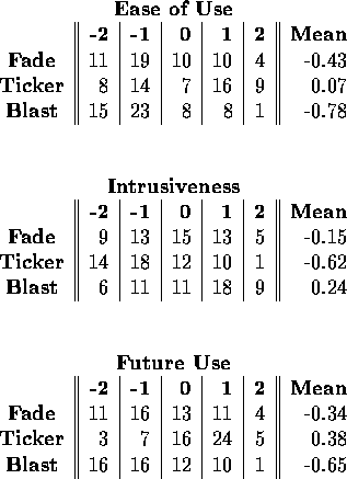
Table 7:
Result totals from the first experiment's post-experiment questionnaire
for the three questions.
(Two no-answers for the first question result in uneven sums.)
-2 indicates the most negative response to the question,
2 the most positive.
At the end of the first experiment, participants were asked
the series of three questions for each of the three display types
for a total of nine questions. The results are presented
in Table 7.
In the post-experiment responses for the first experiment,
the blast was rated least easy to use and most intrusive,
and the ticker was rated easiest to use and least intrusive.
Thus, even though the blast display often resulted in
performance as good or better than the other displays,
it may not necessarily be the best choice
since users did not seem to enjoy using it.
However, recall from the experiment results
that the participants did not perform any more slowly
on the browsing tasks when using the blast display
than when using the fade or ticker.
People seem able to adapt and perform equally well
despite their dislike of the blast display.
At the end of the second experiment, the participants
were again asked the series of questions about their
preferences for animation, this time for the two display types
used by each participant: fade and ticker.
Recall that there were three groups of users:
the normal group that used a normal size and speed,
the slow group that used a slow speed but normal size display,
and the small group that used a small size but normal speed display.
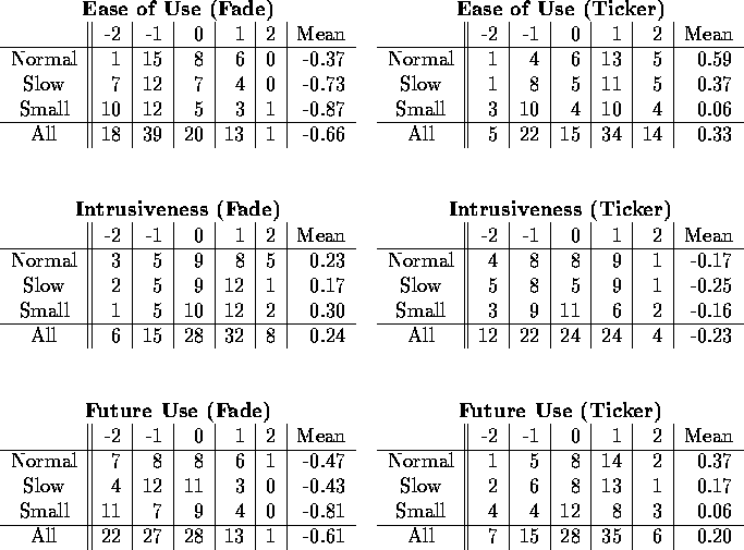
Table 8 summarizes the participants' responses
to the three questions.
For the fade display, the participants tended
to produce negative responses for ease of use,
with 57 negative responses compared to only 14 positive ones.
The smaller and slower displays resulted in
more negative responses than the larger and faster one.
The most negative responses for ease of use
were shown with the small display
with over 5 times more negative responses than positive ones.
No doubt this is because information is often split
over multiple screens in the small display.
In comparison, participants found the ticker relatively easy to use,
with positive responses outranking negative ones
by a 3.5 to 1 margin for normal size and speed
and a 2 to 1 margin for the slower speed.
The smaller size had a 1 to 1 ratio
of positive and negative responses.
Since participants only used one size of display,
they were not biased by having used a larger or faster display
but rather they genuinely seemed to prefer
the larger and faster display.

Table 8:
Participant responses to post-experiment questions
for the second experiment
regarding the ease of use, intrusiveness,
and predicted frequency of future use
for the fade and ticker animated displays.
-2 indicates the most negative response to the question,
2 the most positive.
While participants found the larger and faster display easier to use,
they did not think it was significantly more intrusive.
The positive and negative responses were fairly comparable
across sizes and speeds for the intrusiveness ratings.
However, while participants found the ticker easy to use,
they also found it to be somewhat intrusive,
with almost a third more negative responses than positive.
Again, the small display had the most negative responses,
with 50 percent more negative than positive responses.
For the fade display, the most frequently selected response
for frequency of future use was 0 and -1,
though almost a quarter of the participants indicated
that they would never use it. The most significant contributor to the
negative response was the small display.
Even though participants found the ticker to be fairly intrusive,
most indicated that they would use it often or always.
Positive responses outpolled negative ones by a almost
a 2 to 1 margin. Even the small display, which participants
found least easy to use and most intrusive, generated
almost 50 percent more positive responses than negative.
In summary, the participants found the ticker easier to use
than the fade.
While participants thought the ticker was easier to use,
they also found it to be more intrusive.
Even though participants found the ticker more intrusive,
they indicated that they would be more willing to use it again
than they would the fade.
The participants did not seem at all anxious to use
the fade or the ticker at all times, though few people
ruled out the possibility that they would ever use it.
This indicates that more applications should be targeted for short term use,
like ball score monitors that are only used for the duration of a game
or traffic monitors used only in the hour before leaving to drive home.
The goal of the empirical evaluations was to explore the balance
between distraction, reaction, and comprehension and memorability
when using peripheral animated displays.
The first experiment showed that fading, tickering, and blasting
peripheral displays did not significantly distract users
from a primary task yet can effectively
communicate information, and that the type of animation
impacts performance on awareness tasks.
The second experiment showed that changes in size and speed
can impact performance on awareness tasks.
The following recommendations can be derived
from the results of these experiments:
- Animated displays can be used in the periphery
with minimal negative impact on certain primary tasks.
Both experiments supported this claim when the primary task
involves browsing for numerical solutions in a hypertext environment.
- In-place displays such as fade and blast
are better than motion-based displays like ticker
for rapid identification of items. Participants were able
to complete monitoring activities more quickly when using
the fade and blast than when using the ticker.
This seems to extend prior results that indicated
that moving text is more difficult to read than static text.
- Motion-based displays such as ticker are better than
in-place animations for comprehension and memorability.
Participants who used the ticker obtained a better hit rate
than those who used the blast and the fade.
- Small displays result in faster identification
of changing information. This may be related to
the amount of information that a viewer can read
in a single glance. Larger displays may
make it difficult to obtain the right information.
- Fast displays are better than slow for establishing
comprehension and memorability. This was noted in the second experiment
for the tickering animation and may be related to the amount of
new information that is available in a single glance.
One frequently-mentioned limitation to empirical evaluations
is that they often do not represent an accurate representation
of real-world situations.
For example, in the experiments, participants
used the animated display only for up to an hour.
However, there are many real-world situations
where this would be a reasonable time frame,
perhaps to monitor the traffic between 5 pm and 6 pm every weekday,
or to keep an eye on the scores of selected baseball games
during the pennant drive and playoffs.
In fact, it seems advisable that
programmers should not write applications that employ animation
with the expectation that they will be used continually,
but rather for short, well-defined periods of time.
Another potential limitation of the study
is that the population selected to perform the studies
consisted of undergraduate students attending
a technical school. However, this is perhaps the ideal group
to examine if one hopes to obtain positive results.
They are part of the computer and video-game generation
that has been bombarded with animated displays their entire lives.
It is unclear how well animated displays would work for
older adults who have poorer physical skills and less computer experience,
or very young children who have never used a computer,
or even individual segments of the university population.
As a first step in understanding how user populations differ,
the next chapter describes an observational study
that characterizes users based on their animation preferences
and considers ways to identify them using readily available
habits and traits.


Next: Supporting Awareness with Animated
Up: Maintaining Information Awareness in
Previous: Evaluating Animation as an
D. Scott McCrickard
Mon Feb 12 12:12:24 EST 2001
