In considering the use of animation in peripheral information displays, it is desirable to explore a range of animation styles to understand whether they differ in their ability to communicate and in their potential for distraction. One common method for animating information is with a motion-based effect whereby the old information is moved off the display area while the new information is moved on. In performing the evaluations described in this and subsequent chapters, motion-based effects were represented by a tickering effect whereby old information moves off the screen to the left while new information moves on the screen from the right.
A second common method for animating information is with an in-place effect whereby the old information disappears and is replaced by the new information. In this category, a fading effect was selected whereby the old information fades into the background while the new information fades into the foreground. The expectation in choosing the tickering and fading effects is that other motion-based effects such as vertical rolling will be similar to the tickering effect and other in-place animated effects such as stippling and swiping will produce similar results to those by the fading effect. This is supported by the Maglio experiments described in Chapter 2 that demonstrated that there was no performance difference between participants using vertical and horizontal motion-based effects [45].
Another important factor to explore is the scope and focus of the awareness problem. The preliminary work described in Chapter 3 revealed that a powerful and complex system like Irwin is used in a variety of ways, many extending beyond the scope of awareness. Tasks such as searching, browsing, and reading seem better suited for larger, more attention-demanding interfaces. In evaluating peripheral animated displays, I want to focus on their use in the context of a supplemental activity, with the primary focus on other tasks. The expectation is that people will use the displays only to keep track of the state of information and will use other more suitable tools for searching, browsing, and reading. As such, only the most basic information is provided in the interfaces. Note that this still leaves room for a wide range of awareness-related tasks ranging from using the displays to gain knowledge over time to looking for specific information that is acted upon when it appears.
The pilot study examined the use of animated devices in maintaining awareness of sports scores during the opening days of the NCAA Basketball Tournament. This section examines the role of animation in interfaces, focusing on lessons learned in integrating animation into peripheral displays and in observing how users made use of the animation.
To test the utility of animation as an awareness device, I created tkscore, an application that monitored and communicated scores from the NCAA Basketball Tournament using various peripheral displays. I then deployed the application and surveyed users on their likes, dislikes, and future desires for such peripheral information displays.
The NCAA Basketball Tournament is a single-elimination tournament consisting of 64 teams from across the United States. It generates much interest and is recognized as one of the most exciting sporting events in the nation. The large number of teams in the tournament necessitates that some of the early tournament games be played on weekdays. As a result, numerous people who are working have a desire to stay abreast of the scores of ongoing games, an ideal situation for an awareness tool.
The tkscore application shows the scores of basketball games using either a ticker, fade, or list display. The tkscore tool is started with a single command, which brings up a control panel (see Figure 4) listing all current games and the three available display types. The user can select and deselect the games to be monitored by clicking on the checkbox next to them. The user can toggle between the display types by clicking the radio buttons. The control panel can be dismissed by clicking the OK button and returned by pressing button 3 in one of the display windows.
The list display lists the selected scores and updates them as soon as the scores change without smooth animation (see Figure 5). It shows all of the scores at once but can occupy a large portion of the screen. The fade display uses a fading effect to alternate between scores (see Figure 6). The ticker uses a tickering effect to scroll scores across the screen (see Figure 7).
New scores appear immediately in the list display and on the next iteration for the ticker and fade displays. Score updates are obtained every minute from the USA Today Scores Web Page, http://www.usatoday.com/sports/scores.htm.
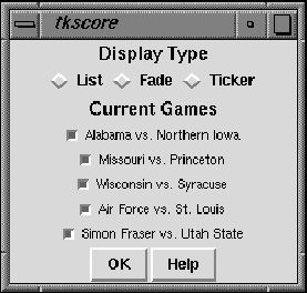
Figure 4:
The main tkscore screen used to select display type
and games. The display types are presented in random order
upon startup to help avoid selection bias.
If the fade or ticker display is selected,
a speed selection bar appears.
Initially all games are selected -
a user can toggle the selection
by clicking on the box next to the game.
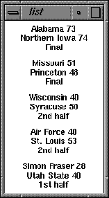
Figure 5:
The tkscore list display. All selected scores are visible.
When a score changes, the list display is immediately updated.
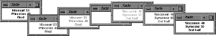
Figure 6:
Seven overlapped time-lapse snapshots
in the operation of the tkscore fade display.
The leftmost, bottom frame shows an initial block of text
representing one basketball game.
The next three frames show how the text fades away into the background,
and the final four frames show how the new text for the next game
appears in the same place.
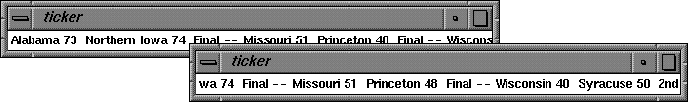
Figure 7:
Two time-lapse snapshots of the tkscore ticker display.
The scores ticker across the screen, and when a score is updated
it appears in the next iteration.
The foreground ticker shows the state a few seconds after
the background ticker.
For the study, all games for that day initially were selected and the participants had to choose a display type from a randomly ordered list of the three choices. The participants were encouraged to use several displays for an extended period of time. The informational and display selections of the users were monitored.
After the study, the participants were asked a series of questions relating to their desires for information and their display preferences. A complete list of the questions and a tabulated list of responses is given in Appendix A (including breakdowns of responses based on animation preferences). The remainder of this section discusses some of the key responses.
Twenty-five faculty and students used tkscore during the first four days of the tournament, and twenty-one of those answered the set of questions. Most used tkscore on several occasions, and most checked scores several times a day during the tournament. The usage monitoring logs (obtained for only eleven of the participants because of technical difficulties) showed that most of the eleven participants tried all of the animations, though only five users changed the animation speeds, and the speeds they settled on varied significantly. The cumulative time that a given participant used tkscore ranged from a few minutes to several hours.
Each display type had its proponents: seven people chose the fade display as their favorite, six chose list, and five chose ticker. The other three did not pick a favorite. Seventeen of the participants had at least a casual interest in the tournament, with eight expressing a desire to know about scores, game status, and more continually throughout the day. A breakdown of the participants' interest level is given in Table 1. Their evaluation of how well tkscore met their informational needs is shown in Table 2.
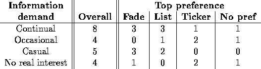
Table 1:
Number of responses to the question ``How would you describe your interest
in the NCAA Tournament?'' from the 21 participants who returned the survey.
The leftmost column of numbers shows the overall count for the
participants while the other four columns show a breakdown based on
the top preference from among the types of displays.
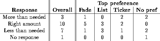
Table 2:
Responses to the question ``How did tkscore meet your needs
for tournament information?''
The reasons for selecting a display varied. The most common reason (given by 15 participants) was the ease with which information could be accessed and read. Ironically, this response was given equally by those who listed fade, list, and ticker as their favorite display. Table 3 shows a breakdown of the contributing factors to display selection.
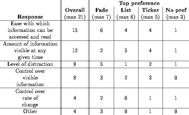
Table 3:
Responses to the question ``What factors contributed
to your choice of display?'' Since each participant could
select multiple responses, the overall responses total more
than the number of participants.
When displaying information in a small space, certain choices must be made in constructing the display. The participants were asked to select the other features of the information that they would like to be displayed. Note that auditory cues, often looked upon as distracting, were the most desired mechanism for the users. Generally, the desire was to have auditory cues tied to important changes to the information, perhaps reflecting the desire to know better when and how changes occur. The second most desired mechanism was easier control over speed of updates, and the third was for more potential for user interaction. Both are related to the desire of users to feel in control of the interface, one of the golden rules of interface development. Improvements to the interface that deal with both of these issues are discussed in Section 6.4.1. A complete list of responses is given in Table 4.
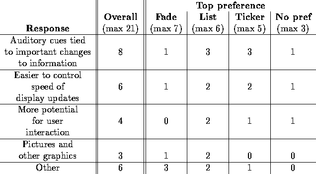
Table 4:
Responses to the question ``What additional display mechanisms
do you desire in a program like tkscore?'' ordered based on
total number of responses.
Each participant could select multiple responses.
Overall, responses to the application were positive. Users expressed desires for similar displays for weather information, news headlines, stock quotes, and activities of friends and colleagues. See Table 5 for a summary of the other informational desires.
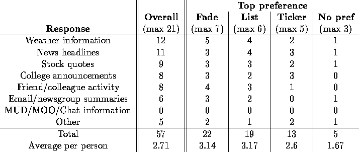
Table 5:
Responses to the question ``With what other information sources
would you use tkscore-like displays?'' ordered based on
total number of responses.
Each participant could select multiple responses.
In developing the tkscore application and in collecting and analyzing the results of this study, several objectives emerged that should be met when designing peripheral displays for maintaining awareness of dynamic information:
These guidelines emerged from personal experiences and from user comments before and during the development of the tkscore interface. To simplify the design and implementation of applications that conform to these guidelines, support for them was included in the development of my animation toolkit. In the toolkit, highlighting techniques help communicate the state of and changes to information. Support for cyclic animation helps minimize space and required user interactions. Mouse bindings help users maintain a sense of control over the information flow. The toolkit is described in Chapter 6.
In the introduction to this chapter, several issues were raised concerning the nature of the awareness task, the role of animation in peripheral displays, and the relationship between the awareness needs of a user and the type of peripheral display that should be employed. This section addresses these issues.
Unlike the Irwin peripheral device, tkscore did not have support for browsing, searching, and in-depth reading of information. As such, people had to be content with awareness-related tasks. They could obtain information on scores, but for deeper analysis they had to turn to full-screen browsers (a more suitable interface anyway).
There was still a wide range of awareness-related tasks that were undertaken by the study participants. The high importance that many people attach to the tournament meant that many of the participants wanted a great deal of information close at hand. Many of them wanted even more information than was provided, such as the time remaining and high scorers. As soon as a game was over, often they would temporarily stop their primary task to pursue more information such as the game story and box score. This awareness task borders on information monitoring, since it occupies a high priority for the users and can cause them to interrupt their current task.
Some participants were content with the occasional glimpse at a score and did not need to pursue the information any further. These participants wanted to learn over time but were not willing to interrupt their current task to pursue the information. Many of them did not have a high degree of interest in the tournament but did want to know about results at the end of the day.
Of course, the participants cannot be divided into two distinct groups. Most would passively allow the display to run, but at certain times between primary tasks they would interact with the display, perhaps pursuing more information on a surprising result. I expect that this is how most people would interact with a peripheral animated display -- at most times they would simply let it run, but occasionally an item of interest would spur them to seek out more information or perform some task related to the item. For this reason, the empirical evaluations described in Chapter 5 analyze performance on intermingled monitoring-style and learning-style awareness tasks.
Before undertaking this study, I had several questions about the role of animation in the awareness process. Would people be willing to sacrifice at least a small amount of space to potentially heighten their information awareness? Can animated displays in fact raise awareness to a suitable level? Or would the animations prove to be too distracting? The pilot study was able to shed some light on these questions.
The first issue is whether people would be willing to sacrifice screen space for a potential gain in awareness. It is obvious from the extended use of tkscore that people were indeed willing to sacrifice a bit of screen space. Some people were even willing to have the entire list at once, though this was one of the reasons one participant gave for not using the list display. In the comments section of the questionnaire, no one mentioned space concerns as a reason for not using the tkscore application.
Note that many users preferred the list display, which required significantly more space and did not animate changes. However, the sacrifice in screen space was still far less than for other options (such as checking the scores in a browser or starting many of the large Java monitoring applets), and the level of distraction was not listed as a major contributing factor in choosing a display for those who favored the list display (see Table 3). Those who were most concerned about being distracted by the display chose the small fade display that included perhaps the most gradual and least intrusive animated effect.
The second issue is whether these types of applications actually raise a user's awareness of the dynamic information. Over half of the tkscore users conveyed satisfaction with the information provided, and those that were not satisfied typically wanted more information to be displayed (the time remaining in the game or the players with the most points). While it is unclear whether users actually learned anything or whether they were able to accomplish other tasks, the users' satisfaction with their awareness levels is one important factor. Several of the most avid fans seemed to need more control over the rate at which new information was obtained: they repeatedly hit the reload button for a Web page, making the awareness of scores a primary rather than secondary activity.
Another concern is that a constantly changing display will be too distracting to the user. I attempted to evaluate this by asking users if the level of distraction was a factor in selecting a display. Five of the six users who preferred the list display also stated that level of distraction was a significant factor in selecting a display, which seems to indicate that some users prefer occasional sudden updates to the display over continuous animation. However, five of the seven fade proponents and two of the five ticker proponents also listed distraction as a significant factor, so there may be other factors in effect.
Maintaining user control over information flow is well-established as an important factor in designing visualizations and interfaces. None of the users listed it as a major motivating factor in selecting an interface, though some listed it as desirable in future versions of the tool. The main concern was the ease with which more information could be obtained. An action that allows the user to jump to a Web browser showing details of the game of interest may best solve this problem. It is important to recognize the bridge between maintaining awareness and obtaining information, and to allow separate modalities to accomplish each.
One goal of this research is to understand better the communication strengths and weaknesses of the types of animation introduced in this thesis. Do the animations differ in their ability to communicate information, and if so, what types of animations are best suited for different situations? One indication of the relative qualities of the animations can come from a comparison of the informational preferences of the participants who favored each device. The relatively even division of top preferences (seven for fade, six for list, and five for ticker) suggests that no single animation type is best suited for every person and every situation.
Consider the question that asked for additional desired display mechanisms. One of the options was audio, generally considered to be highly intrusive. Interestingly, the data reveal that only one of the seven fade proponents wanted auditory cues, compared to three of five ticker proponents and three of six list proponents (see Table 4). This suggests that perhaps the fade proponents are less willing to be disturbed by audio, suggesting that perhaps they chose the fade animation also because it was less intrusive or less cognitively demanding.
The list display was the only one that did not use smooth animation. It also takes up the most screen real estate. For these reasons, it is more like a standard application designed to command the attention of the user and not like an awareness device intended only to provide secondary information. I suspected that the participants who favored this display were extremely interested in the scores and were willing to sacrifice physically and mentally to stay up to date. The data bear this out. Table 2 shows that half of the list proponents found that the list, while their favorite, provided less than a desired amount of information. Compare this to fade (one of seven) and ticker proponents (one of five). The comments of the list proponents seem to further support the hypothesis. One noted that ``I wanted info besides just the score, like pertinent stats on key players". Another said ``It was much easier to use CBS Sportsline", a Web page that provides a large display showing significant information.
A concern from earlier work was that the difference in information type was the primary reason for differences in animation preferences. Since the type of information in the pilot study was held constant yet the users' animation preferences still differed, the difference must not be due solely to the information but to other factors such as differences in the communication properties of the various characteristics of animation, or differences in individuals. This information can be used to better match animation characteristics to awareness tasks and to user populations.
One potential reason for the differences in preferences could be differences in the communication properties of various types and characteristics of peripheral displays. Perhaps one type of animation, say a fading effect, is fundamentally better than another for certain types of tasks. Perhaps there is an ideal size for a peripheral display. The empirical evaluations described in Chapter 5 explore these and other possibilities.
Also important in the understanding of the role of animation in the awareness process is its integration into applications in ways that are most helpful to different people with a variety of needs. In so doing, it is important to understand how certain characteristics of individuals can shape their willingness to use and benefit from animated displays. As a hypothetical example, a person who spends long hours at the computer might prefer the ticker. The observational study described in Chapter 7 was conducted to examine this possibility. Based on the knowledge gained from the pilot study, I expanded the interface to include more informational options and more control over the display options. The new tkwatch interface can display news headlines, stock quotes, weather information, and sports scores. The user can control the color, font, and size of the display as well as the presence of history-based shadowing and automatic highlighting described earlier. The study examines the correspondence between display choices and informational desires for potential users and categorizes users based on observed and reported behaviors.