This study focused on understanding user preferences for animated displays. The goal was to be able to understand the different ways that people might use peripheral animated displays. The approach described here attempted to learn personal characteristics and animation preferences of potential users and to uncover relationships between the characteristics and preferences. The expectation in this approach is that system designers should be able to predict animation preferences using readily available characteristics about the users. By better targeting applications to the needs of the users, designers will be able to create peripheral displays that allow their users to obtain information more easily.
As with tkscore, tkwatch users can select a fade, ticker, or list display. In addition, the appearance of the tkwatch displays are configurable. Users can alter the font, color, and speed of a display and can turn on or off the automatic highlighting and shadow history techniques described in Section 6.4. Figure 20b shows the tkwatch display interface.
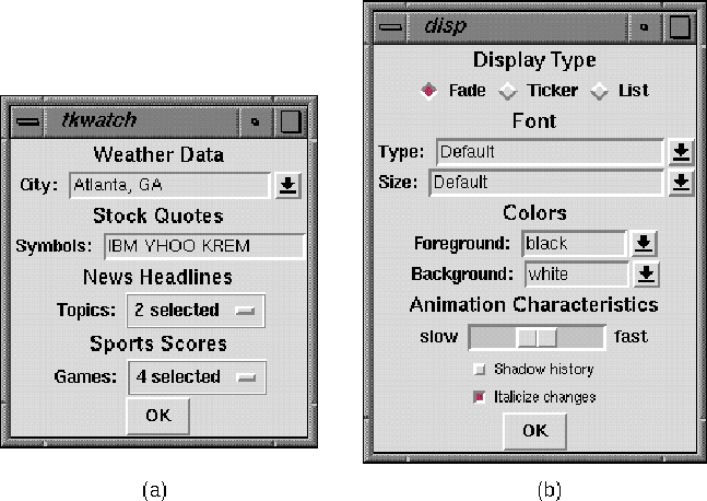
Figure 20:
The tkwatch (a) monitoring and (b) display configuration interfaces.
The monitoring interface allows users to select information to monitor,
including weather for a city, symbols for stock quotes,
categories of news headlines, and scores of games.
The display interface lets users change various aspects of the display,
including the animation type, the font type and size,
the foreground and background colors, the animation speed,
and the shadow history and automatic markup change indicators.
For the observational study, the tkwatch interface was augmented to record data about the information that participants monitored and the manner in which it was displayed. Every action by a user to tkwatch, from selections of information and display options to clicks and grabs of the animation, was recorded. The data were stored in a .tkwatch subdirectory in each participant's home directory.
A general call for participation was made to faculty and student members of the Georgia Tech College of Computing. A special invitation was made to participants in the tkscore pilot study and to members of the Information Interfaces group in the College. While a group that is knowledgeable about interfaces may not accurately reflect the population as a whole, these people seemed more likely to explore various configurations of the interface. In addition, the nature of their work provides them with the opportunity to use the interface extensively in a short period of time.
After agreeing to participate, each person completed a pre-study questionnaire focusing on two areas: computer usage and information consumption habits. The complete survey can be viewed in Appendix C; a brief summary follows here.
The computer usage questions asked for estimates of the number of hours per day spent at the computer, the percentage of time spent on various activities (coding, writing, email, Web browsing, etc.), and the types of desktop information monitoring tools (email biffs, clocks, load monitors, etc.) that the participants use. These questions were intended to establish a basic understanding of how each participant interacts with the computer on a day-to-day basis with the expectation that a relationship between computer use and animation preferences would become apparent.
The information consumption questions asked about frequency of Web browsing, examples of Web pages visited, and participation in other Internet activities such as MUDs, Usenet news, and chat rooms. These questions were intended to examine the frequency with which the participants sought information with the expectation that a relationship between information consumption and animation preferences would become apparent.
After completing the questionnaire, participants were asked to use each display for an extended period of time in a variety of sizes, shapes, and configurations. The various types of available information and the ways for displaying it were outlined, and exploration was strongly encouraged. In monitoring information, participants were asked to consider how different types and configurations of animated displays are better for different types of informational situations. As noted previously, all user actions were timestamped and stored in a file in the participant's home directory. Before the files were generated and collected, participants were informed that the monitoring would take place and were given the opportunity to review the files before the data were processed.
In collecting this information, the hope was that the way in which participants interacted with the animated interfaces and the monitoring selections that they made would be related to their animation preferences. As a hypothetical example, perhaps participants who primarily use large displays also prefer the tickering animation, or participants who frequently interact with animations by clicking or dragging also prefer faster animations.
After having the opportunity to use tkwatch for several days, the users were interviewed during a 30 to 45-minute post-study session. Participants were asked a few general questions about their preferences for the devices, the factors that they felt contributed to their choice of display, and their motivations for monitoring different types of information. Primarily, however, the sessions gave participants the opportunity to expound upon the impacts and constraints of the animated displays, particularly on browsing habits, attention to other tasks, and general informational needs. The expectation was that comments from participants would help to understand their motivations for making the choices that they did. This in turn should simplify the processing of the data that were collected.
The next section profiles each user. Later sections look at some trends and categorizations that emerged based on participants behavior and consider how the knowledge gained might impact the design and use of peripheral animated displays.
For the interested reader, this section provides a detailed profile for each of the participants in the observational study. Others can feel free to skip ahead to the summary and discussion sections following this one for a more general analysis of the results.
Milt spent about 8 hours a day at the computer, most of it coding and debugging. He used an email biff, a clock with a second hand, and the grosview load monitor. He typically checked the Web at least four times a day, religiously in the morning, at lunch, and before he left, then whenever he had a free moment.
Milt used tkwatch for five days. He monitored sports scores, news headlines, and weather information. Although he generally got adequate information on topics from tkwatch, occasionally he was motivated to seek out a full story. Generally the information was interesting to know, but not things that he would have sought out on his own. Without tkwatch, Milt ``would never have known that Boy George was almost killed by a glitter ball''.
Milt liked both the fade and ticker, the fade because he could navigate quickly through the items by clicking on them and the ticker because he could see more information at once since multiple items can be on the screen simultaneously. Milt noted that news seemed better suited for ticker because he could just glance up and see one or more headers, while fade was better for sports scores where he could rapidly flip through the entire list. Milt did mention that the fade often caused ``disappear anxiety'' since items often disappear while he was reading them and, unlike with the ticker, there was no way to stop it.
Since Milt did not have a strong preference for fade or ticker, the factor that generally dictated which display type he used was space: he considered the size and shape of the available space and chose the animated display that best fit the space.
Milt used the automatic highlighting and history-based shadowing but did not notice them. He said he did not have much need to know when changes occurred.
Rod spent about 8 hours a day at the computer, much of it coding and debugging with a good amount of Web browsing as well. Rod ran a clock, a grosview load monitor, and a MUD, which was constantly active and to which he contributed every few minutes. He checked the Web two or three times a day, generally whenever he had a free moment.
Rod used tkwatch for three days. He tried various types of information but in the end only monitored stock quotes. He greatly preferred the list display because he could see all of the information at once and because there was generally no motion on the screen. His second favorite was the ticker because he could grab, move, and stop it. He surmised that he might prefer a vertical scrolling (rolling) since that would be more like a MUD. The fade was his least favorite - he felt it gave him the least control over the information that he saw and showed him the least amount of information at any given time.
Rod liked the simplicity of the design and does not feel a need for additional visual cues like highlighting and shadowing. He did not want additional graphics that would take up space. He definitely did not want audio cues to indicate when information changed.
Stan spent about 8 hours a day at the computer, most of it on email. He ran a large number of desktop tools, including an email biff, a clock, a load monitor, xpostit, the Irwin interface described in Section 3.1, and an Internet information delivery and discussion tool. He browsed the Web about once a day but did not visit any particular site on a daily basis and did not have any set times of day for browsing.
Stan used tkwatch for five days prior to the interview and at last count for over three weeks afterward. He monitored news, stocks, and weather information. Stan was very passive in his use of tkwatch, he would look at headlines but not feel the need to pursue the story elsewhere. Sometimes he would look at Irwin, which contains more information, to get more information, but did not go out to the Web or elsewhere.
In general, Stan preferred the ticker, with the fade second. The list was his least favorite because he felt it occupied too much of the screen. Going into the study, he thought that he would prefer the fade, but could not find a speed that was ideal for him. At first, he slowed it down from the default speed but found it distracting. He then sped it up and liked it better but was annoyed when the information would fade away before he had a chance to read it. Ideally, he would have liked to speed up the fading effect but lengthen the delay between fades. The ticker was a bit too fast at the default speed but was fine when he slowed it down. A big win with the ticker is that there is always something on the screen to read.
Stan found the automatic highlighting somewhat useful, but not the shadowing because it was too hard to read. He felt that other cues like images or colors might be useful. He envisioned color coding information based on type, with stocks yellow, sports scores blue, and so on. He did not see a need for more intrusive cues such as audio, in part because his other tools (in particular Irwin) already provided them.
Dan spent about 11 hours per day at the computer, most of it coding and debugging. He used various desktop tools, including an email biff, a clock (with a second hand), and the grosview load monitor. Prior to using tkwatch, he ran the Yahoo stock ticker, but as tkwatch contains the same functionality, he stopped using it. He browsed the Web at least four times a day (whenever he had a free moment) in search of ``news stories and high-tech gadgets''.
Dan used tkwatch for two days before the interview. He was particularly interested in monitoring stocks and the weather, but also monitored news for a while. He occasionally pursued news stories and other information that he saw in tkwatch, and he felt he would have done it more had it been easier to do and had he had more free time.
Dan liked the ticker best but wanted it to move faster, about at the speed at which he reads. He liked the ability to drag the ticker to move the information more quickly. He didn't want to wait for the information to be able to read it. The fade he felt got in the way - ``there were too many useless states'' where the display was in an in-between state and nothing could be read. Ideally, he thinks he would prefer a fade with no intermediate states where the information would be blasted onto the screen with no gradual animation. He would also like the option of scrolling information (particularly stocks) vertically. Given some improvements, he feels he would use such a tool at all times.
Dan did not feel the automatic highlighting was necessary given the way he used tkwatch -- he was not particularly interested in seeing an item as soon as it appeared but rather in browsing through the items when he had a free moment. The history-based shadowing was not advantageous because he could not read it with a single glance. He suggested color-coding information to emphasize categories. Just as Dan found that images were unnecessary in other peripheral displays, he did not like the idea of including images with the display.
Alan spent 12 hours per day at a computer, most of it coding and debugging. He ran a biff, a clock, a load monitor, a scheduling tool, and an Internet information delivery and discussion tool. He browsed the Web at least four times per day.
Alan used tkwatch for five days. He monitored news, stock quotes, and the weather. He was pretty happy with the amount of knowledge that it provided and did not feel the need to seek out more information.
Alan's favorite display was the fade because he found it to be the least distracting, particularly at a slower speed. He felt that with the ticker he always had to wait for the information to appear and would lose focus. He noted ``using the ticker required a higher cognitive load'' and while the amount of information he processed and retained might be increased, to him it did not seem to be a fair tradeoff. He does not like tickers in other situations either, for example ``the weather ticker comes on during a TV program, and if I look up for a moment I always miss something on the ticker.'' Alan did not like the list display: ``it took up too much space.'' He is generally a passive user, but maybe once a week he would rapidly click or drag through the items.
Alan felt that his choice of display depended on the type of information he wanted to monitor. He felt that the ticker was better for information that is smaller and had a fixed size (stock quotes and sports scores) because there was less chance that part of it will be cut off. Also, he noted that people are familiar with tickers for information of that type, specifically stock tickers.
Alan turned on the highlighting and shadowing but seldom noticed them, probably because ``there was not much new stuff''. He did not find them distracting either, though. While he reported that he likes graphical alerts of changes like he had seen in other tools, he worried that additional graphical (and particularly audio) alerts in a tool like tkwatch would be distracting.
Fred spent about 6 hours per day at the computer, most of it sending email and browsing the Web. The only other desktop tool he used is a clock, though he had used an Internet information delivery and discussion tool for a while. He browsed the Web several times a day, generally in the morning during breakfast then whenever he had a free moment.
Fred used tkwatch for three days. He monitored stock quotes, sports scores, news headlines, and the weather. He enjoyed pursuing more information on topics that he saw and wishes it was easier to do. He felt that tkwatch helped him to ``surf smarter'' by showing him when a ball game is over and a summary was likely to have been posted. Previously he would constantly pull up and reload a sports scores page to monitor the progress of games, a far more time-consuming activity. When Fred found the displays to be distracting, he would move them from the top of the screen to one of the lower corners.
Fred liked the fade display the best. He would enlarge the window and increase the font size to make it easier to read, slow it down to give him more time to read headlines, and regularly click through all of the information. He often sped up the display for sports scores because they change so often and because they are easy to read. Fred liked the ticker more than he thought he would. He appreciated the ability to adjust the speed and direction on the fly without using the configuration screen. He thought that the constant tickering motion would be a distraction, but after using it for a short time he found that it was not. The list was Fred's least favorite. It took up too much room with larger fonts and was difficult to read with smaller ones.
Fred found that he used the ticker and fade differently. He looked at the ticker more often and quickly processed the multiple chunks of information on the screen at any given time. The fade forced him to look at and think about individual chunks.
Fred really liked the history-based shadowing for stock quotes. He was able to see see how his volatile Internet stock was changing over short periods of time. He tried the automatic highlighting but found that the italics was not enough of a clue. He reported that he would prefer other visual cues like color, and iconic flags for other information like new news. He also reported that he would like images associated with the information.
Tom spent about 9 hours a day at the computer, most of it reading papers online and chatting with friends and family. He used an email biff, a clock, an ICQ/buddy tool, and an Internet information delivery and discussion tool. He browsed the Web less than once a day, generally just to get information about classes or to check on restaurants or fun activities.
Tom used tkwatch for four days. He most enjoyed the weather information but also monitors news, stocks, and sports scores. He felt that tkwatch provided him with interesting news that he would not otherwise see. He would have liked to be able to customize the presentation with filters to identify articles of particular interest.
The fade was Tom's favorite display. He preferred it at a speed slower than the default where he could look up occasionally and have time to read the entire contents of the display. The list confused him because it was difficult to determine when the information changed. He said the ticker was ``horrid'' because it moved too slowly and the display seemed crowded with multiple items in it.
While Tom did not like the ticker on his desktop, he acknowledged that it does have its place. He would enjoy it more in a public place like a cafeteria, but he found it required more sustained attention.
While Tom occasionally found the displays to be distracting, he did not turn them off, though he did cover them with other windows if need be. He felt that his primary tasks when sitting at the computer of reading papers and chatting with friends affected his preferences for a type of display.
Tom used the highlighting but did not notice it when it appeared. He found that history-based shadowing tended to clutter the display. He thought that a more subtle change showing age of the information may better differentiate old and new in situations like his where he did not need to know about changes as soon as they occur.
Jim spent about 10 hours per day at the computer, with coding and debugging as his primary activity. He ran an email biff, clock, the grosview load monitor, and scheduling tool. He typically checked the Web over three times a day whenever he had a free moment.
Jim used tkwatch for four days. He monitored weather, news, and stocks for the company he used to work for and their biggest rival. He typically was happy with the level of knowledge that he obtained from tkwatch and did not feel the need to seek out more information.
Jim's favorite display was the fade. He liked it at a slow speed where he could read the information before it disappeared. The list was his second favorite, but he wanted to see more information than can be shown on the screen at once. He suggested that the fade and list be combined, where multiple units of information could appear on the screen, fading between different things. Jim thought the ticker was OK, but he would have preferred it to go faster. He felt the ticker was best suited for contiguous, related information like weather data and the forecast. His top priority was to see all information on a topic at once, which was why he liked the fade and list.
Jim felt that the shadow history was ``a good concept, but was too jammed together'' making it difficult to see the old information. He thought that the italics was more useful, but that color might be even better for highlighting changes. He did not see a need for auditory cues and felt that would be a distraction.
Matt spent up to 4 hours per day at the computer, typically to do some specific activity that can only be done at the computer. As such, he did not clutter his screen with any displays not directly related to his current task - no email biff, no clock, no load monitor, nothing.
Matt used tkwatch for ten minutes. He did not like the constant motion of the ticker and fade, and the list occupied too much space on the screen. He liked the content in other similar interfaces slightly more, primarily because he could read information about local occurrences. To him, the ideal place for these types of displays would be in public places such as the picnic table study area of front entrance, where people could read them while looking away from their work or while waiting for friends.
Mack spent about 6 hours per day at the computer, with major components being coding, writing, email, and Web surfing. He usually browsed the Web at lunch and whenever he had a direct need for it.
Mack used tkwatch for two days. He monitored news and weather, and wished it were easier to configure the tool to show specific information. He was skeptical about an automatic configuration feature, however. He did not feel a need to seek out more information than was on the screen. He had a work (and play) routine and he stuck to it.
Mack liked the fade best because it used the smallest region of the screen. He found the ticker to be distracting, but noted that he did not use it for very long and that it may get less distracting with longer use. He did not like the list because he could not tell when the information was changing.
Mack liked the automatic highlighting because it indicated which news items were newest. He felt that the history-based shadowing was not good for news and suggested associating it with certain types of information like stock quotes and sports scores. He would not like other highlights, particularly not audio ones. He turned off his email biff because the beeping annoyed him.
Mack used a virtual windowing system and chose to position tkwatch only on the screen that contains his email screen. He felt that with email, he had numerous pauses which gave him the opportunity to look at tkwatch. While working, he did not want the distraction, and while browsing the Web, he typically would be looking for specific things.
Will spent about 5 hours a day at the computer, most of it sending email. The only desktop accessory that he ran is a clock. He browsed the Web almost exclusively for research purposes and did not visit any sites on a daily basis.
Will used tkwatch for seven days. He primarily monitored news and weather, but occasionally would monitor a stock that he was interested in purchasing. He thought that he would enjoy the weather the most, but it did not change often enough. He monitored nine of the possible ten news topics (all of them except sports).
Will's favorite display was the ticker. He felt it was ``not distracting, and provided more information'' while the fade ``pulled my eye to it more.'' He found the list the least useful because it was difficult to determine when a change occurred. ``I assumed it would do something clever when something changed - it didn't!''
Recall in the pilot study in Section 4.1, participants were asked to select their favorite peripheral display. For comparison, participants were again asked to select their favorite display, this time ranking them from one (favorite) to three (least favorite). Ties were allowed -- they were allowed to select more than one display as their favorite. The first portion of Table 9 shows their selections.
Note that the fade display was the favorite of seven of the users, followed by the ticker with four and the list with one. This distribution is in stark contrast to the pilot study which resulted in fairly equal votes for each (fade was the favorite for seven participants, list six, ticker five). While the fade and ticker distributions are comparable, far fewer people preferred the list. There seem to be several differences between the two scenarios that may have contributed to this difference.
The first is the importance that people place on the different kinds of information. The tkscore interface was only used to show basketball scores during the NCAA Tournament, a high-interest event in which a single loss would eliminate a team. This seems to suggest that a user would want to see all pertinent information and changes as soon as possible, even with the additional space sacrifice that comes with the list display.
The second is the amount of information that can be displayed at any given time. In the tkscore study, the only available information was NCAA tournament basketball games, and there were at most eight games occurring at any given time. In tkwatch, the user could select literally hundreds of items considering the numerous types of news headlines and the almost limitless number of stock quotes. A list display can only show 10 or 12 items before it scrolls off the bottom of the screen. Granted, a user could have selected less information (as some did), but perhaps that is an unreasonable expectation in such a short-term study. I would expect that participants would gravitate toward the occasional monitoring of a small number of items at selected times.
The pre-study questionnaire was intended to establish a general understanding of the computer usage patterns of the participants. The ``Reported'' portion of Table 9 provides a summary of the responses to several of the primary questions. The complete survey tabulations can be found in Appendix C.
The first column of the ``Reported'' portion provides the number of hours per day that each participant spends at the computer. Since the participant pool was made up of computer scientists, the numbers are larger than one would expect from a typical cross-section of users. However, this allowed a large number of usage hours to be logged in a short time, speeding up the acclimation process. Fortunately, it was learned from the interviews that the participants differed significantly in their approaches to computing; that is, in what they did with their time at the computer.
The second column provides the participants' estimates of the number of times they access the Web each day. Those that access it more than four times per day or less than once a day have a plus or minus by their entries. Note that the participants who spend a lot of hours at the computer generally spend a lot of time browsing the Web. However, there does not seem to be a trend connecting time at the computer or Web uses per day with a particular favorite display.
The third column indicates the number of peripheral desktop applications each participant typically runs. These applications can include email biffs, clocks, load monitors, chat tools, plan tools, and other similar applications that occupy a piece of the screen periphery.
The monitored information includes the data collected from participant interaction with the animated peripheral displays. The ``Monitored'' portion of Table 9 provides a summary of some of the more interesting results gleaned from the data logs. A more detailed look at the monitored information can be found in Appendix C.
The first two columns in the ``Monitored'' portion of the table show the relative ticker and fade animation speeds that the participants typically selected by the end of the study. The expectation was that participants would experiment with various speeds before settling on a single desired speed. (The data and interviews seem to reflect this behavior.) The normal speed for fade and ticker is the default speed as identified by participants in the pilot study. Note that participants seem to prefer faster speeds, particularly for the ticker. Perhaps this is because there is much more information that is to be displayed, and participants are more anxious to see it all.
The third column indicates whether participants manually controlled the flow of information by clicking, grabbing, and dragging. A ``yes'' response indicates that participants controlled the flow more than five times, while a ``no'' response was less than or equal to five. The expectation was that participants may experiment with the manipulations on a few occasions, but would only do so repeatedly if they found it useful.
The fourth column reflects the median number of informational items monitored by a participant. An informational item is weather data, stock quotes, sports scores, or a news topic. As one might expect, participants who monitor a large number of items tend to dislike the list display, which requires screen space proportional to the number of items being monitored.
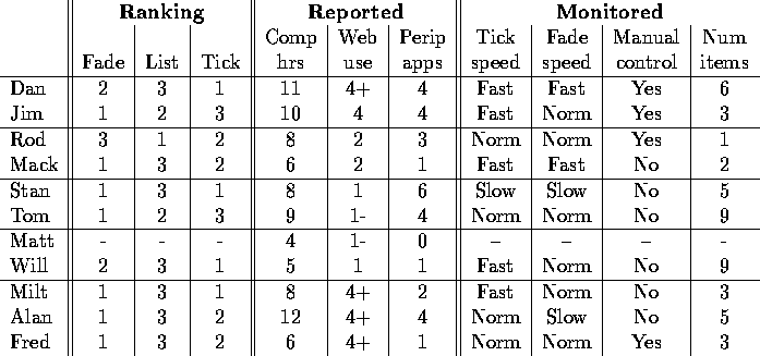
Table 9:
The user-assigned rankings of favorite display types,
reported computer usage statistics,
and measured usage statistics of peripheral displays.
A dash indicates a missing value.
The plus (minus) next to some numbers indicates that the value
is greater than (less than) or equal to the indicated value.
The names are grouped according to the identified categories:
the first group is information junkies,
second greppers, third thinkers, and fourth computer-as-tool users.
The last set of participants were not a close match
for any of the groups.
Based on his behavior, Dan closely matches the information junkie profile. He spent eleven hours per day at the computer and browsed the Web more than four times per day. He liked using a fast ticker, and he was the most likely participant in the study to grab and move the ticker to read the information.
Jim also is a close fit for the junkie category. He spent ten hours per day at the computer and browsed the Web four times per day. While he indicated a preference for the fade and list displays over the ticker, his problem with the ticker stemmed from the fact that it did not move fast enough.
Based on his behavior, Rod best exemplifies an information grepper. He focused on one task at a time and only browses the Web when he had a specific informational need. He was interested in seeing a select few stock quotes because he had money invested in these stocks and wants to know about changes as soon as possible. Mack also exhibited traits of an information grepper. He monitored a small list of items, though too many to show in the small space he was willing to dedicate to tkwatch. He had a preference for the fade over the list because of space concerns and because the motion drew his attention to it.
The pilot study brought out the grepper role in many people. The importance of the tournament motivated people to keep close track on the information, and the small amount of information available in the display (only scores of a limited number of games were available) made the list a viable option. This may explain why so many more pilot study participants preferred the list compared to observational study participants.
Based on their behavior, Stan and Tom are both thinkers. Both mentioned that they slowed down the fade considerably to give themselves time to read the information. Neither liked to interact with the display by clicking on it, and neither seeks out more information about stories that they see in the display.
Stan ran more peripheral desktop applications than any other user. He enjoyed being able to glance at various points of his computer screen to obtain information without having to explicitly seek it out. Stan suggested that he would like to ``speed up the wipe but not the delay'', that is, the information should be on the screen for a longer period of time but the fading action should be less pronounced.
Tom also used a large number of peripheral desktop applications. Tom noted that he ``didn't like to zip through the news'' but instead preferred to glance at it occasionally to take in headlines at his leisure. His primary tasks at the computer were reading papers downloaded from the Web or emailed to him.
Matt is a computer-as-tool person. He only sat at his computer to accomplish specific tasks. For him, the computer was ``a tool, not part of the environment.'' He was not likely to linger there and did not want to drag out his current task with potentially distracting information. To him, the positioning of such information was important: he might enjoy ``a giant screen next to the picnic tables'' where people study and socialize.
Will too is a computer-as-tool person. He spent much of his day away from the computer, and he did not occupy his screen with peripheral displays other than a clock. He reported that he is an avid user of mobile and handheld displays, and he seemed enthusiastic about non-desktop displays.
Many people occasionally exhibit computer-as-tool person behavior. Consider that Mack, though he spent a good deal of time at the computer, said he would only use an application like tkwatch while doing a select set of tasks. He tried tkwatch on various screens of his virtual desktop but ended up leaving it on the screen containing his email because that was where he spent the most relaxing time. Similarly, Tom worked at several computers and only used tkwatch at the one where he read papers, chatted with friends, and replied to email. Both users used different computers for different tasks and view informational applications like tkwatch as appropriate and complimentary for only a select set of these tasks. Tom suggested that a tickering display would be ideal ``in public places when I was alone or in a dull conversation'' and would not mind focusing on such a display.
Table 9 groups the participants according to the category in which they best fit. Since not all of the participants were a good fit for a category, clearly there exist other categories of users. A closer, more in-depth characterization of the participants and a larger, more diverse user population would help to broaden and strengthen the set of categories.
In several cases, participants seemed to fall into more than one category. While this might seem problematic, it was to be expected. People who share a common preference for a particular type of animation are likely to share only a few characteristics. This actually seems to be advantageous to designers who are targeting potential users -- an application designed for a particular population potentially will appeal to a much broader group. For example, the similarities between information junkies and thinkers suggests that an application designed for a junkie might also appeal to a thinker.
The categorization of an individual seems dependent on the situation. One would imagine that at some times in any given day or week, a person would be more like an information grepper, while at other times the same person would be more of a thinker. As was seen earlier, Tom stated that he only uses tkwatch when he was reading papers, chatting with friends, or sending email. At other times, Tom suggests that he would prefer to see animated displays away from his desktop. This suggests that Tom at times was a thinker, while other times he was more of a computer-as-tool individual.
To provide direction to the inclusion of animation in peripheral displays, this study has sought to understand the relationships between personal characteristics and animation preferences that may prove helpful in constructing appropriate displays. To summarize the results of the study, several guidelines for the use of animation in peripheral displays can be suggested:
Using these guidelines, application builders can seek to understand their target user population and build the application to meet their needs. For example, in designing a tool for system administrators, one might expect them to fit the information junkie category, spending long hours at the computer and checking the Web frequently for breaking information. As such, one should perhaps design an application that uses a fast tickering effect to support peripheral awareness. By considering the characteristics of the target user population and designing applications that will be most suitable for them, designers can create useful and usable peripheral applications more quickly and easily.
In addition to focusing on more and better categorizations, further work should consider additional methods for supporting awareness. Several users mentioned that they did not like the list display because it was difficult to determine when information changed. Much of this problem may be the perception that a static display does not change while a dynamic one (the ticker and fade) does. After all, the ticker and fade may very well constantly cycle through the same information, but a user will be aware of the motion and will think that updates are taking place. To combat this problem, a static list display can incorporate auxiliary display indicators like flags to highlight new information or time data to indicate when the last change occurred. More important changes that demand immediate attention or that could affect the health and well-being of a viewer could even be accompanied by an audio cue, such as the warning beep that accompanies emergency weather bulletins on television.